The image has a blue background with the words 'Workplace Wellness' written in a sans serif white font. The letter 'H' has been superimposed over the 'W' in 'Wellness, turning the word into 'Hellness.'

Workplace Hellness

Analysis. Snark. Survival strategies.

Erika Strandjord

1 minute read

Defacement

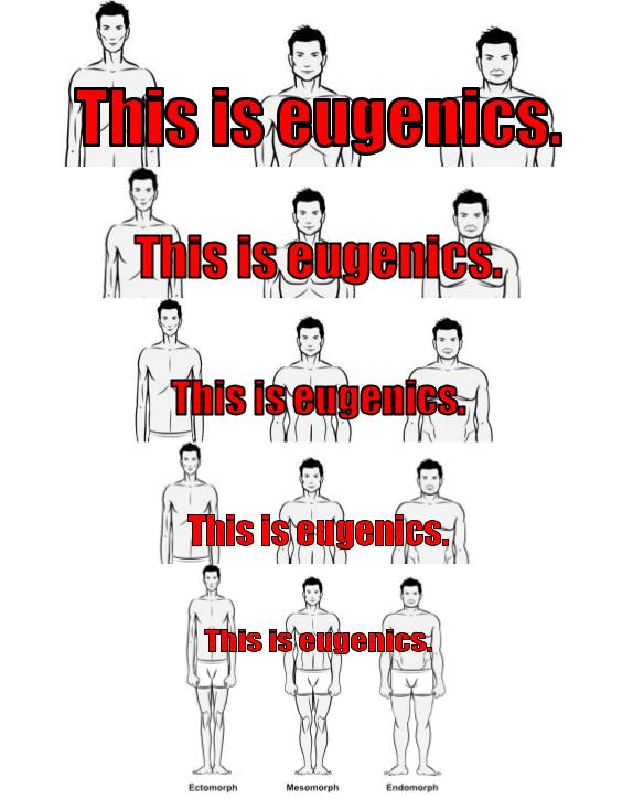
CW: Ableism, calorie counting

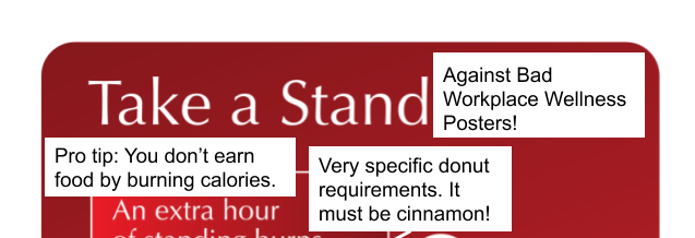
Sometimes you don’t need to write an entire post to point out what’s wrong with something; instead, you just need to deface it! This week’s bonus Fix-It Friday post features a poster from Heart Foundation, an Australian non-profit dedicated to promoting heart health. (Q: Do I feel like a monster for making fun of non-profits trying to save people’s lives? A: Not when the posters they produce are terrible.)

The image is a poster with a red background. The title reads "Take a Stand" and shows a bunch of white cutout figures standing around a table. One of the figures wears a dress. A textbox reads, "An extra hour of standing burns 600kj⁠—that's a cinnamon donut!" I have added text boxes and speech bubbles to the image. The first text box appears after the title, so that it now reads, "Take a Stand Against Bad Workplace Wellness Posters!" Around the box talking about kilojoules and donuts, I have added text boxes that read, "Pro tip: You don't earn food by burning calories" and "Very specific donut requirements. It must be cinnamon!" I have given three of the four cut-out people speech bubbles. One reads, "Well, this is awkward." Another reads, "Can any of you read those documents on the table?" and the third reads, "I was promised a cinnamon donut." Two additional text boxes read, "Why is everyone so...white?" and "#worstmeetingever." A final textbox points at a white cut-out chair that is on the lower left of the image and reads, "Poor visual design choice."

comments powered by Disqus

Recent posts

See more

Categories

About

Workplace Hellness is a blog dedicated to critiquing and lampooning bad workplace wellness programs and messaging.